Tuesday, 14 May 2013

Finished A2 teaser trailer: Against the wall and Written Directors Chair Interview


Written Directors Chair Interview


1)In what ways does your media product use or challenge conventions of real media products?

Prior to filming I was introduced to the conventions present in teaser trailers; 30-90 seconds in length, quick transitions in between shots, atmospheric music in the background, in some cases little to nothing dialogue and many more.

I can confidently say that our media product uses conventions present in real media products to communicate the genre and concept of our teaser trailer with our target audience. For example during the editing process i included quick transitions in between shots (especially during the chase scene) along with atmospheric music in the background and dialogue from the interrogation, furthermore using Final Cut Pro i altered the lighting of every chasing shot to black and white to make them appear as flashbacks. I understood that through many years of conditioning my target audience would subconsciously recognise these conventions and identify my teaser trailers genre and concept. Feedback on my teaser trailer has confirmed that through the use of conventions my target audience has successfully understood the concept of my teaser trailer. This demonstrates how through the use of real media product conventions it enhanced my ability to communicate important information (e.g. genre and concept of the teaser trailer) to my target audience. 

The pacing in teaser trailers is a significant convention because it can determine the genre presented throughout the teaser trailer. For example in the majority of horror and thriller teaser trailers the pacing is slow allowing the momentum to build and around halfway the pacing increases in speed resulting in a climax at the end of the teaser. My teaser trailer conforms to this specific convention in pacing because it successfully teases the audience by providing them with a lot of new information about the main characters without revealing too much. 

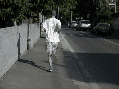
The use of dialogue ,the sound bridge of the the interrogation, is another convention i decided to use because it enhanced my ability to develop the protagonist as a character with many sides to his personality; for example seconds before John pushes his victim against the wall Malika's character states that John 'would never hurt a fly'. Through this use of juxtaposition my target audience would have felt compelled to ask many rhetorical questions which would have increased their interest towards the teaser trailer. 


Prior to filming i was influenced by the hand-held camera technique used in the film Cloverfield because i noticed that as soon as the teaser began the hand-held camera technique grabbed my attention ; this technique was unorthodox and gave the teaser a eerie and realistic atmosphere.Which is why during the start of the teaser trailer i used the hand-held camera technique, i wanted to gain the audiences attention almost immediatly and the hand-held camera technique was successful in achieving this. 

In conclusion my media product has used many real media product conventions. These include the use of quick transitions in between scenes, the sound bridge of the interrogation, the pacing of the editing allowing momentum to build until the climax at the end of the teaser.  Through the use of these conventions it enhanced my ability to communicate important information to my target audience ; the complexities of the protagonist, the genre and concept of my teaser trailer. 

2)How effective is the combination in your main product and ancillary tasks?

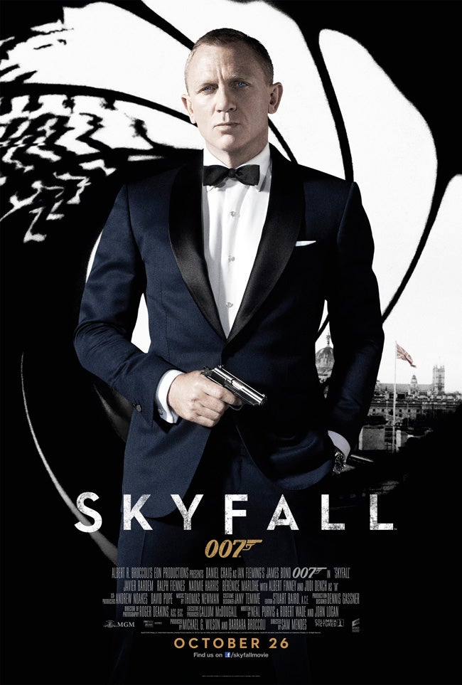
We intended to portray gritty and realistic themes throughout our main product 'Against the wall', to build a bridge of communication with our target audience. Therefore we continued to portray these gritty themes through the use of the contrasting black and light grey background colours in our magazine cover and film poster shown below. We decided to use both these contrasting colours throughout our main product along with our magazine cover and film poster because it served as an ongoing motif that could be subconsciously recognised by our target audience. 


This technique of using the same colour schemes in magazines covers, film posters and teaser trailers have been used in both the hollywood and the independent scene. 

For example the film Looper ,starring Bruce Willis and Joseph Gordon-Levitt, uses the colour 
blue in both Total Film's magazine cover and its very own film poster. Even in the teaser 
trailer the colour blue appears in a couple of scenes. Through the use of this technique of
similar colour schemes there will be a slight association being made by loopers target audience with the colour blue and looper; making loopers film poster and magazine covers unique and recognisable. I believe that we have use this technique effectively by combining the colour schemes (black and light grey) of our main product and ancillary tasks to make out product unique and recognisable.


I believe that the combination in my main product and ancillary tasks were very effective in establishing  the brand identity for our product because our film poster and magazine cover built on the ambiguous nature of our main protagonists delivered in our teaser trailer 'Against the wall' .This build on the characters ambiguous nature increases our target audiences curiosity and interest because they feel compelled to find out more about the protagonist since they can relate to some parts of his lifestyle, for example they could relate to his gender ,age, aspirations and choice in clothing (e.g. wearing popular brands like Nike). We were careful with the clothes we chose for our protagonists to use in the magazine cover photo shoot as well as the film poster photo shoot because we understood that it was  important for our target audience to make connections (identifying themselves) with the main protagonists. 

In conclusion I can confidently say that the combination in my main product with the ancillary tasks was very effective. The combination between the two helped to establish the brand identity for our product through the use of colour schemes consistent in both our main product and ancillary tasks. 


With the growing internet community promoting my product through social networks like Facebook and twitter would be less time consuming and less expensive than advertising on billboards and bus stops. I strongly believe that if we focused on creating more exposure and awareness for Against the wall on YouTube, it would successfully create a buzz exposing the film to our target audience.

3)What have you learnt from audience feedback?

After receiving audience feedback on my main product against the wall, I received the weaknesses and strengths of my teaser trailer. 

I've learnt that through the use of conventions present in thriller teaser trailers my audience understood the concept of my teaser trailer. For example the majority the audience stated that they acknowledged that they were watching a thriller teaser trailer because the pacing was "slow in the beginning and then picked up the speed near the end creating a climax".  


However it seems that my use of the sound bridge with the interrogation scene could have been executed smoother since many people suggested that they could hear the transitions in the dialogue between shots. After hearing this piece of criticism I watched against the wall a couple more times and to some degree I agree. In my next project I will insure that the sound bridge is executed with more precision. 


Another person stated that he enjoyed the camera angles used to capture the chase scene however another person suggested that there should have been a bigger variety of shots. This is an interesting piece of criticism because during the editing processes I had a discussion with my partner whether to add more shots; I did not agree with the idea because it made the teaser trailer appear as an opening sequence. Our decision to not add a variety of shots had a positive and a negative because some people thought that we needed to add more shots and some people thought the opposite. I will take this into account in my next project.


Most importantly I learnt that the audience made connections with main protagonists because they identified themselves with their social class, age, gender and choice in clothing. When I asked them if they were interested by the characters or the setting one person gave the following answer "I live around those estates where you filmed and that took me by surprise". After the audience finished watching the teaser trailer I asked the same person if he felt any type of connection with the protagonist and he replied “Yeah I did feel a connection because I always see people getting chased around my area". This shows that through the use of the setting the audience made an immediate connection with the protagonist. Therefore I've learnt that setting is really important because it can help the audience to make connections with the concept of the film and their own lives which enhances their interest.   


In conclusion I’ve learnt that a majority of my target audience understood the concept of the teaser trailer along with the genre making my teaser trailer a success because my primary intention was to communicate the concept of the teaser trailer; that the choices you make can cause serious consequences. I also learnt that my use of sound bridge could have been more precise which inspires me to develop my editing skills before I start on my new next project.


4)How did you use the media technologies in the construction and research, planning and evaluation stages?


During the research and planning stages I used YouTube to browse through a variety of different teaser trailers in order to choose 5 to analyse on blogger. YouTube was crucial in my research and planning because it provided a wide variety of teaser trailers through the suggestion box and the comments. This enhanced my knowledge of teaser trailer conventions while also providing access to other teaser trailers that broke the conventions. YouTube also provided infinite insight into the mindset of many different audiences by adding a comment section underneath the embedded video. For example through the comment section I discovered that a majority of people were tired of CGI dependent blockbusters which swayed my decision to add as little Hollywood elements like CGI or car chase scenes as possible in my teaser trailer.  During the evaluation stages I referred to the comments on my teaser trailer on YouTube to demonstrate that my audience understood the concept of the teaser trailer. Youtube was very useful during the construction stage because when I was unable to navigate through a programme i could find tutorials to help me. For example when i was using photoshop i was struggling to navigate through the programme so i went to youtube to find tutorials on how to navigate through photoshop.This increased my understanding and enhanced my ability to create a magazine cover and film poster. 

In conclusion I used Youtube to gain a deeper understanding of teaser trailer conventions during the research stage, which enhanced my ability to perform a more detailed and analytical analysis on 5 teaser trailers. I used Youtube to improve my navigation skills through programmes like Photoshop, which enhanced my ability to create both my film poster and magazine cover.  


During the research and planning stages i used google to browse through a variety of different websites   including Empire.com and TotalFilm.com. Access to these websites enhanced my understanding of magazine covers and their conventions. By developing my understanding on magazine covers it increased my creative control while i was producing my own magazine cover. For example I used the same masthead as Sight and Sound because i recognised that this magazine was aimed at our target audience , which was a mature audience who enjoy critically acclaimed films instead of big blockbusters.
During construction I searched the web using google to find sound bites and music to use in our teaser trailer. Google provided a wide variety of sound bites and music which enhanced my creativity because I had the power of choice allowing me to experiment with more sounds and music.  Google was very useful during the research and planning stages because it contributed an infinate amount of analytical information on teaser trailers and films in general. I was provided with a lot of examples of effective storyboards and shotlists, furthermore it increased my understanding of how to make storyboards and shotlists effectively to use during the construction stages. For example websites like http://accad.osu.edu/womenandtech/Storyboard%20Resource/ improved my ability to create storyboards, it describes how to make a detailed storyboard including camera angles and specific transitions. 
In conclusion I used google to improve my understanding of coventions present in film magazine covers and film posters. This benefited me during the construction stage because I had the choice to either use or brake conventions which increased my creative freedom. I used google to improve my ability to create a detailed storyboard, furthermore I increased my ability to use my storyboard effectively during the construction stage of my teaser trailer.

During the research and planning stages i analysed 5 teaser trailers, magazine covers and film posters on blogger. I also wrote posts about my inital ideas and how they changed over time. Blogger was a very useful tool because it improved my organisation skills. I used blogger because it shows a sense of progression, for example I could observe how my inital ideas have developed over time and how through my planning and research i created a solid concept for my teaser trailer.

Record label letter

Island Def Jam Records 

8920 Sunset Blvd. 2nd Floor

Los Angeles CA 90069
Hi, I'm currently putting together a teaser trailer for my A2 media course, and we would like to use the song ‘Reservoir Scars’ made by one of your artists named Ransom. However we understand that due to copyright reasons we must first have Ransom's permission. Since we have a small limited budget, we would appreciate it if we could use ‘Reservoir Scars’ without being charged a fee. If there are any further questions do not hesitate to contact us. You can reach us through our email intenseproductions@hotmail.com
Thank you for your help with this matter and we look forward to hearing from you.
Truly yours,
Pablo Ortiz

Thursday, 31 January 2013

My screenplay


Against the wall
Screenplay by Pablo Ortiz

EXT. Police station
Wide Establishing shot of a police station.

INTER. Police questioning room
Wide shot of a small dark room. You can see a lamp illuminating the face of a 17 year old female teenager; mixed race wearing a black jacket. She is sitting down with her hands resting on a table.

Police officer
Give your name and date of birth.

Mallika
Mallika Jackson … 12 July 1995.

Police officer
Are you related to John Jackson?

Mallika
Yes john is my step brother.

Police officer
OK, tell me why you think you’ve been asked to come to the station.

Mallika
I haven’t committed any crimes so I don’t know why I’m here.

Police officer
I’m going to ask you some questions about your brother.
The quicker you answer them the quicker you can leave.

Mallika
Why? Is my brother in some sort of trouble?
Police officer
…..

This is the first page of my screenplay which is 3 pages long. I introduce two characters ; Mallika and the police officer and I don't reveal a lot of information about the plot .I decided to use Mallika's character to describe John as a Polite and kind figure in this screenplay because it helps to create more interest in John's character since the audience haven't seen him yet. 

Tuesday, 22 January 2013

Sin City poster analysis

This film poster see's the main protagonist , Bruce Willis, in the middle of the poster reinforcing his importance in the film. His facial expression is the only one looking downwards suggesting guilt and vulnerablity however his body language along with the gun in his hand portrays a powerful figure showing that this poster reveals the contradictionary nature of the main protagonist. Bruce Willis is shown in a slightly low angle  which also reinforces his power.
Sin City is a graphic novel adaptation and this poster shows that the directer has chosen to stick closely to the comic books roots ; this is shown by the comic book like red font. The effect of the falling rain along with the dark background makes the poster seem gritty which reflects the comic books original nature. This may have been done to please the hardcore fans of the original graphic novel and this helps to create excitement and buzz because this reinforces the idea that the rest of the film will stick to the themes of the comic book.

The title of the film is the largest form of text suggesting that the directors are focusing more on the themes of the comic book rather then the big named stars like Bruce Willis and Jessica Alba to name a few. The fact that there's not a lot of text apart from the title also suggests that this poster hasn't chosen to conform to the conventions of film posters. By not adding a lot of text on the poster the interest is directed towards the charaters and  this increase the mystery surrounding them ; this helps the poster to poses the element of mystery. This will gain the attention of the audience because it will make them ask rhetorical questions about the film which makes this a successful film poster.

From analysing this film poster i've decided that  when creating my own film poster I will focus alot of my attention towards how the charaters are portrayed (e.g the clothes and props that they will be using) because they reflect the themes of my film. This helps to build mystery around the main protagonists which makes the audience to ask rhetorical questions which creates interest and this will make my film poster effective.

The master teaser trailer analysis


This is the teaser trailer for The Master directed by Paul Thomas Anderson starring Joaquin Phoenix. After Joaquin Phoenix's last controversial off the wall documentary style film 'I'm still here' Joaquin Phoenix's core fan base and critics must be curious to see what more suprises Joaquin has in his upcoming film The master. Held toghether with slick dialogue and a haunting soundtrack in the background this teaser trailer successfully keeps the audience on the edge of their seats; by showing a montage of scenes together with a V.O in the background between a police officer and Joaquin,  Joaquins character instantly becomes an enigmatic figure. The stellar acting along with a variety of different shot angles is the strong point in this teaser trailer because it doesn't reveal a lot of information about the plot but it still keeps the audience captivated. The style in which this teaser trailer is shot e.g heavy dialogue with limited action scenes suggests that it aims for a sophisticated audience, this is also reinforced by the choice of actors; both Joaquin Phoenix and Philip Seymour Hoffman  have a reputation of starring in critically acclaimed films. This might also show how big well known actors have been used to help market the film by creating a buzz among critics and core fans bases.
  
This teaser trailer has heavily inspired my teaser trailer. The sophisticated cinematography is what I aim to emulate and even though I might not have well known actors at my disposal, i believe that the dialogue will help to capture the audiences attention and imagination.

filming issues

last friday we went to film some establishing shots of a police station however due to the sudden heavy snow we had to postpone filming. Even though it stopped snowing on sunday the roads are still unsafe to film on, our location is also still covered in snow and therefore filming the chase scene will have to be postponed because its a hazard for both the crew and the actors.
 

Thursday, 17 January 2013

location scouting

 Yesterday we found two rooms that we can use for the interigation scene. we chose the room on the right because it isn't spacious which helps to create a closed and intimidating atmosphere because there isn't anywhere to hide. we want to create this atmosphere because it helps to show the audience what the interviewee is feeling. However we chose to use the other room on the left too because we wanted to experiment with the lighing options by dimming the room to create an erie atmosphere.

Tuesday, 18 December 2012

Teaser Trailer information


Students in group
Camera operator: Joel Gordon
Actors: Brandon, Terrell and Malika
Producer: Joel Gordon
Director: Pablo Ortiz
Editor: Pablo Ortiz and Joel Gordon
Researchers: Pablo Ortiz
Storyboard creator: Pablo Ortiz
Screenwriter: Joel Gordon
Title of film
The Wall
Genre:
Thriller
Synopsis
Two best friends looking for a thrill to end the school year so they join a gang and get more that what they bargained for when things go down hill
Genre conventions
Chasing sequence
Wide shots and implications of violence
Target audience
Young adults 15-25
Location(s)
Estate near Clapham Junction
Props and costumes
Hoodies, Gloves, School uniform and casual attire

Monday, 17 December 2012

Finished Storyboard


We decided to add a lot of detailed information for each shot (e.g shot angle, lighting, shot duration and audio) because we realised that when we start shooting, this will help each shot to be more focused and organised. For example we know that the first shot will be a high angle shot which will last for 10 seconds with digetic dialogue. However even though each shot is organised we will still experiment with different shot angles because what i learned from my AS course last year is that the more variety shot angles you have the more creative you can be during the editing process.


While creating my storyboard I came across this teaser trailer for The Master which is directed by Paul Thomas Anderson starring Joaquin Phoenix. The second half of this teaser trailer which shows an on going interview between a police officer and Joaquin Phoenix's character hooked my interest in the film for the following days due to the engimatic atmosphere that it created by not revealing too much of the storyline. This inspired and helped me to create my storyboard , I realised that the key to creating a successful teaser trailer is to keep the audience wanting more information about the film by only revealing an interesting part of the film or storyline.

Monday, 3 December 2012

Marvel Avengers Assemble teaser trailer analysis


This is the teaser trailer for Marvels Avengers Assemble directed by Joss Whedon starring Scarlett Johansson, Chris Evans and Robert Downey Jr. This teaser trailer begins with a V.O and an establishing shot of New York followed by some panning shots across the windows of a variety of buildings, the transitions in between shots are fast and wide shots are used to showcase the exploding cars. This creates a chaotic atmosphere, once the V.O ends the soundtrack begins in the background, the transitions in between shots are slower in order to concentrate on the characters and this last for 30-40 seconds. The soundtrack gets louder as the transitions in between scenes get faster creating some momentum, the teaser trailer then ends with the soundtrack fading into the background.

Special effects like exploding cars are used to create a chaotic atmosphere because the target audience are interested with action scenes and this chaotic atmosphere present in the trailer suggests that there are going to be a lot of action scenes throughout the film. This helps to create excitement and a buzz amongst the target audience.

Even though when creating my teaser trailer I won't have the budget big enough to have some of the effects present in this trailer, I think some of the shot angles used were interesting for example the wide shots used because they perfectly showcased the cars exploding. I will definitely incorporate some wide shots in my teaser trailer.

Story pattern for our teaser trailer

In todays lesson we discussed different trailer patterns to use which included Character-driven  (This trailer pattern focuses on the main characters), Plot-driven ( this pattern focuses on the plot throughout the trailer), Trigger-event ( this pattern focuses on the element that changes and theme-centered trailers which focuses on the films theme throughout the trailer.

In my group we decided that we're going to use the character-driven trailer pattern along with plot-driven pattern because in order to make our storyline's twist impactful on the audience we have to spend time on the character development. However one disadvantage with using the character-driven pattern trailer is that if the dialogue isn't engaging enough this could bore the audience. So in order to avoid the audience from losing interest while watching our trailer because of the heavy amount of dialogue we decided that we're also going to use the plot driven pattern because this way it will allow the trailer to gain some momentum while keeping the audiences attention. An example of both these patterns being used in a trailer successfully can be seen in the trailer for the film 'Sightseers' which can be seen below:


Roughly 40-50 seconds of the trailer is a V.O used to introduce both the main characters with some insight into how they behave. However before the audience can sum up the film's storyline a twist is introduced in which a murder takes place which gets the audience of guard, the rest of the trailer focuses on the film's plot.  In my opinion this trailer demonstartes how if used effectively both the character driven and plot driven trailer patterns can compliment each other well resulting in keeping the audience interested on the edge of their seats wanting more.This is why we have decided as a group that we want to emulate this style when making our teaser trailer.  

Sunday, 2 December 2012

Skyfall poster analysis

The composition of the Skyfall poster see's the main protaganist, Daniel Craig, alone in the centre suggesting that the narrative may concentrate purely in him rather then other character reinforcing his importance to the story. The use of props like the gun suggest that the film will contain some violence, this also suggests that this film poster has decieded to conform to the conventions seen in action film posters. Daniel Craig is wearing a blue suit which contrasts against the white and black background, this helps him to stand out showing how props have been used to reinforce his importance in the film.

What I noticed about this film poster that surprised me is the level of simplicity because it doesn't reveal too much which adds to the mystery around this bond film. The dark background suggests that this bond will be much more darker and serious which is reinforced by the serious expression and gaze on Daniel Craig's face.

I've learnt that by not revealing a lot in the film poster it can engage the audience because it remains an enigma to them which encourages them to watch the trailer to learn more about the film. This shows that by using this method of not revealing alot in the poster it can hook the audience into watching the trailer which makes it a successful poster.   

The Hunger Games teaser trailer analysis


This is the teaser trailer for the film The hunger games directed by Gary Ross starring Jennifer Larence. This teaser trailer begins with a variation of wide shots of a forest that transition slowly for 15 seconds, suddenly the female protaganist appears holding a bow and arrow looking around the forest. The soundtrack is slowly beginning to play in the background. After an extreme close up focused on the eyes of the female protaganists a V.O begins of male character talking to the female protaganist reasuring her that she will survive, the soundtrack begins to get louder and the transitions in between shots become quicker, this successfully creates momentum in the teaser trailer which engages the audience. The teaser trailer ends with the film title being shown against the logo on the film which is set on fire suggesting that there will be some violence in the film.

This teaser trailer has shown me that by switching up the speed of the transitions in between shots from slow in the beginning of the teaser to fast near the very end, it can create some momentum in the trailer that will help to engage an audience. I've also learnt that by having a V.O in the teaser trailer it can help to raise questions in the audiences mind which will increase their interest in the film because the storyline has been left as an enigma for them until they watch the film.  

Thursday, 22 November 2012

Taken 2 poster analysis


The composition of the Taken 2 poster sees the main protagonist, Liam Neeson, alone on the left side. This suggest that the narrative may concentrate purely on him rather then other characters reinforcing his importance to the story. The use of props like the gun for example suggests that violence will be present in the film which is a convention of the action movie genre. This suggests that this poster has decided to conform to the conventions seen in action movie posters. The tagline 'First they took his daughter now they're coming for him' increases the element of mystery within the poster because for those who are not familiar with the first Taken, the tagline will raise questions in their minds like 'why did they take his daughter and why are they coming for him?'. This increases the level of interest in the film before it comes out demonstrating how ,if used correctly, a tagline can hook the attention of the audience by raising questions about the film in their minds .The black clothes Liam Neeson's character is wearing makes it easier for him to stand out because theres a contrast between the black clothes and the grey background showing how props have been used to reinforce Liam Neeson's significance in the film.

Monday, 19 November 2012

Analysis of Tron magazine cover


This issue of Empire magazine is promoting the film Tron legacy released by Disney Walt Pictures.Olivia Wilde is featured on the front of the cover gazing straight at the reader; this technique is used to attract the attention of a casual reader by making eye contact. Olivia Wilde's blue eyes have been emphasized with the light blue background to focus all of the attention towards her eyes to insure that eye contact is made. This technique is very effective and I intend to emulate this in my magazine cover. Olivia Wilde has starred in many mainstream movies including Year One and Alpha Dog; through these movies along with many tv appearances (e.g The OC) she has built a fan base. Empire has decided to place her on the front cover to attract her fan base and reach out to many casual readers who aren't familiar with Empire.

The iconic Empire masthead remains the same bright red colour along with the font  demonstrating that this magazine cover hasn't broken any of its own conventions.

Monday, 12 November 2012

Our survey

http://www.surveymonkey.com/s/BRVXDH6 Click here to take survey

Survey questions and why they were chosen

  1. What was the last teaser trailer you saw?The reason why we have chosen the question above is because it can give us an idea of what current teaser trailers look like and what genres they are and this can help us to decide what genre our teaser can be and how to structure it so that it seems like a real teaser edited by a professional.
  2. Will you or did you watch the film after seeing the trailer? The point of this question is to find out if the teaser had an effect on the viewer and what we can add or take away from ours to improve it and make it worth watching.
  3. Did you ever feel like a trailer deceived you after watching the film? The point of this question is make sure that our trailer can be as good as the film and not only show the two or three main parts in the film.
  4. What film genres do you enjoy?This is to give us an idea of what genres the age group which our film enjoy and how to make it appealing to them
  5. How do you watch trailers?This gives us and idea of where which should show the public our teaser  e.g. if most people answered YouTube we would try to advertise it as much as possible on that website.
  6. How often do you search the web for trailers? This question is to help us make sure that our teaser is available to public when they are looking for a new film to watch or just looking.
  7. What is your favorite film? This also helps to know how we should structure our teaser and how the films chosen teasers were put together.
  8. Did you see the trailer? This question is only to help us find out if people actually watch films because of the trailer or because of something they heard.
  9. What do you expect to see in a trailer for a film with a thriller genre? This is to give use and idea of what to include in the teaser so that it is eye catching and worth taking up 2 minutes of the viewers lives.
  10. How many movie trailers do you see on TV?  This gives us an idea of how many times the teaser trailer should be shown so that it sticks.

Monday, 5 November 2012

Analysis of The Dark Knight Rises Empire cover


This is the Empire cover of The Dark Knight Rises, the composition see's one of the main characters ,Bain, in the middle of the cover reinforcing his importance in the film. The white font used in the bottom left corner to spell out 'The Dark Knight Rises' holds some significance because it helps to immediately capture the interest of a casual magazine reader because due to the black background of the cover the white title instantly stands out.        

Tuesday, 16 October 2012

Ill manors film poster


This film poster is for ill manors, the composition of this film poster sees the film's main protagonist, in the center which suggests that the narrative may concentrate purely on him , reinforcing his importance to the story.. The gun being held by the protagonist demonstrates that this poster uses conventions of a thriller poster because by showing the gun it suggests that the film will have some violent content which demonstrates the genre of the movie,which is a thriller. The clothes that the main character is wearing suggests that this film will revolve around teenagers e.g the hat that the character is wearing is synonymous with teenagers and the trouble they face which is reinforced by the gun.

Monday, 8 October 2012

Our storyboard


We wanted to have clear idea of how long each shot was going to last , so we numbered each shot and then added the details on another sheet. For example for the last shot number 8 we described the type of shot. 

  
We added some dialogue to create some character deveopment however the dialogue might change when we create our script.

Sunday, 7 October 2012

My Moodboard


These images above capture the different moods and attitudes that I want to portray in my teaser trailer. For example the first image showing four teenagers in hoodies conceiling their faces holding weapons, has a dark and negative atmosphere in contrast to the five teenagers smiling in the next picture . The Gif signifies the chase scene in my teaser trailer along with the hand-held camera technique we are going to use.

Thursday, 27 September 2012

Importance of our surveys

last lesson we analysed our survey questions and dicussed which questions we had to change, in
order to learn more information on our target audience, e.g their likes , dislikes and hobbies. So along with my group we came up with more focused and detailed questions like 'what are your aspirations?' and 'do you think using sterotypes in a film is a good idea and if so why?'. I found this lesson very useful because it helped me understand the significance of our survey, and how by making our survey successful we can gain detailed information about our target audience , which we can use to mold our main characters to make them more relatable.

Monday, 24 September 2012

Adulthood poster analyses


This film poster is for Adulthood , the composition of this film poster sees the film's main protagonist, sam, in the center surrounded by the other characters.This suggests that the narrative may concentrate purely on him rather then the other characters shown surrounding him in the poster. The central location also reinforces his importance to the story. The baseball bat next to the protagonist ,sam, suggests that the film will have some violent content which demonstrates the genre of the movie,which is a thriller. The baseball bat also demonstrates that this poster uses conventions of a thriller poster.The clothes that the main character is wearing suggests that this film will revolve around the struggles that teenagers face which is reinforced by the other characters surrounding sam.

By analysing this poster I learnt that by using a simple prop ,like the baseball bat, it can help to demonstrate the genre of the film. I also learnt that , the type of clothes that the characters are wearing in the film poster, will reflect which social class is being represented in the film. This will be useful in the future,when I start creating my own film poster because now I know what techniques I can use to demonstrate the genre of my film along with what type social class will be represented in it.

Thursday, 20 September 2012

Development of our main characters

During my last lesson we dicussed collective identity and how the word identity can cover many aspects of an individual, for example we discussed how the details within our passports can identify us as an individual.
This lesson was very effective because it made me think about how I want to present the main characters, for example during the lesson I learnt that clothes can be used to identify a specific type of social group ( e.g the majority of teenagers are associated with hoodies) so after the lesson I started thinking about what type clothes the main characters will wear and what type of identity they may have when wearing these clothes. I also started to think about our main characters gender, ethnicity and occupation. After discussing with my group we decided to make both the main characters white british males because stereotypically men are seen as strong and physical and we are filming in london ( which is why they are british) , violence is present in our plot so it made the most sense to make them male. We decided to make them both students who are 17 because around this age sterotypically teenagers are confused about life which is the message that we are trying to convey in our teaser trailer. Finally we also decided to make them dress smartly because that will present them as normal students which is the look that we\want to project.

Wednesday, 19 September 2012

Reaction to our film pitch

Last week we presented our film pitch in front of our class , our logline was very successful in capturing their attention and they understood the plot of our teaser trailer when we explained it in more detail, which implies that we succeeded in making our plot simple and therefore easy to understand. This is one of the benefits that we received after doing our film pitch , we also benefited from the questions that were being asked by our classmates, because I noticed that they were very interested in the main characters and how they're going to be presented differently when compared to similar characters in similar films like Adulthood and Bulletboy. This therefore reminded me that in order for our plot and main characters to be presented effectively, our group has to put a lot of thought into how we can make our main characters original and charismatic.

Our Film Pitch


Title:  Against the wall.
Genre: Thriller.
Time period: Contemporary.
Location: UK, London.
Budget: Low to medium.
Target market/Demographic: Young males and females aged 18-25.

LOGLINE:
London, two friends are fascinated by the street life and the adrenline that they get from it however they underestimate how much risk they are placing on their lives,  until one night when they accidently kill the leader of their gang's little brother.

TREATMENT:
In South London two naive male friends from a high class background get bored with their perfect lives , so in search of a trill away from their overprotective parents , they end up hanging around with the wrong people and end up joining a gang. The two friends are fascinated by the street life and the adrenline that they get from it however they underestimate how much risk they are placing on their lives,  until one night when they accidently kill the leader of their gang's little brother. The two friends decide to leave the gang behind but are not allowed to leave by the leader who is determined to find his brother's murderer. The two friends leave anyway and never come back which raises the suspicions of the leader resulting in the two friends getting hunted down leading to a cat and mouse chase between the leader and his gang and the two friends, now the question is will they find a solution to their problem ? or will they run out of places to hide ?.

New idea

Within my group we decided to change the idea for our teaser trailer because we agreed that our original ideas were too ambitious and unrealistic , which is why our new idea is simple and not too complex. Filming will take place in different parts of London and our plot is the following ; In South London two naive male friends from a high class background get bored with their perfect lives , so in search of a trill away from their overprotective parents , they end up hanging around with the wrong people and end up joining a gang. However they underestimate how much risk they are placing on their lives, until one night when they ,by accident, kill the leader of their gang's little brother.  The two friends decide to leave the gang behind but are not allowed to leave by the leader who is determined to find his brother's murderer. The two friends leave anyway and never come back which raises the suspicions of the leader resulting in the two friends getting hunted down leading to a cat and mouse chase between the leader and his gang and the two friends, now the question is will they find a solution to their problem ? or will they run out of places to hide ?.