 The composition of the Skyfall poster see's the main protaganist, Daniel Craig, alone in the centre suggesting that the narrative may concentrate purely in him rather then other character reinforcing his importance to the story. The use of props like the gun suggest that the film will contain some violence, this also suggests that this film poster has decieded to conform to the conventions seen in action film posters. Daniel Craig is wearing a blue suit which contrasts against the white and black background, this helps him to stand out showing how props have been used to reinforce his importance in the film.
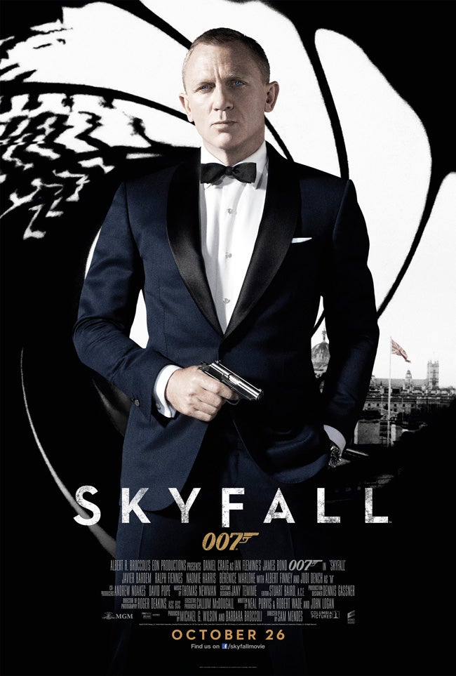
 What I noticed about this film poster that surprised me is the level of simplicity because it doesn't reveal too much which adds to the mystery around this bond film. The dark background suggests that this bond will be much more darker and serious which is reinforced by the serious expression and gaze on Daniel Craig's face.
I've learnt that by not revealing a lot in the film poster it can engage the audience because it remains an enigma to them which encourages them to watch the trailer to learn more about the film. This shows that by using this method of not revealing alot in the poster it can hook the audience into watching the trailer which makes it a successful poster.
No comments:
Post a Comment